Aunty
Patsy's

 |  |
|---|---|
 |  |
 |
The Brief
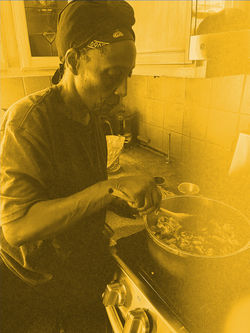
Aunty Patsy is a Caribbean food identity rooted in Trinidad & Tobago and broader West Indian culture. The goal was to create a brand that felt genuinely cultural — joyful, communal, abundant — without defaulting to the visual shorthand that dominates the space. The competitive landscape is crowded with mismatched fonts, oversaturated flag colours, and unstyled food photography. Aunty Patsy needed to stand apart: designed with intention, warm with purpose, and immediately recognisable as something made rather than assembled.
The Approach
The work began with a moodboard rooted in vintage Caribbean tourism posters, market culture, and folk art — establishing a visual language built on hand-lettered type, rustic shapes, and a palette of deep reds, warm yellows, and lush greens, punctuated by dusty pink and sky blue. A competitive audit confirmed the white space: no existing Caribbean food brand in this landscape feels cohesive, crafted, and authentically cultural all at once. The identity leans illustrated over photographic, expressive over polished, and specific over generic. Aunty Patsy's voice mirrors that — warm without being saccharine, proud without being loud.
Role
Strategy & Creative Direction


